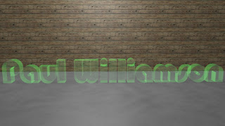
My mam has a wedding company and has asked if I can help her redo her website and if I can come up with some 3D designs to add to it. So when I was making my name title I decided to try out a few for her as well. It is again on Cinema 4D and I tried out difference textures with different lighting.
I like the black and white design better as I feel it stands out more, the green one reminds me of B & Q or a garden centre so that one I am definitly not going for. I have sent the black and white to my mam and am waiting back to hear what she thinks.
I also tried out a few other textures on names, trying out backgrounds, lettering and lights on cinema 4D.
The two I like the best are the first one and the last one, they stand out more to me and look better (in my opinion).
I am enjoying working with cinema 4D now, at the beginning of the course I wasn't too much of a fan but now that I have had more experience on it I am liking the tools and what they can do.


No comments:
Post a Comment